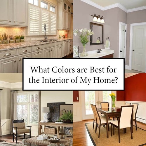
Interior Color Selection Tips for Your Home
Claude Monet said “Color is my day-long obsession, joy and torment.”
When our Design Studio Manager, Heather, meets with clients for their color appointments, she notices that many people are unsure on paint color for their home. Some people are afraid of color while others use bold colors as a way to express themselves. Here are some notes from Heather about color, the affect it can have on our mood, and tips on how to use color within your home to create the perfect scheme to reflect your individual personalities.
Color and how we react to it are part of our everyday life. Color sets the stage, the tone, the feel of a room or space. That said, paint color is one of the last things I choose when working on inventory homes or working with new home buyers during their design consultation. If you pick the paint color first, you’ve limited all your other selections.
One of the first questions you should ask yourself when trying to select a paint color is “what is the FUNCTION of this space?”. What do you DO in the space? For most of us, the bedroom is where we sleep and relax at the end of the day. Do you want your bedroom to be peaceful and soothing or exciting and energetic? Should your dining room be formal and rich or casual and breezy?
Color affects our moods. While bright, primary colors may seem fun and a great idea for a child’s room, certain colors can increase activity and stress levels. Do you want a color that will ENERGIZE or CALM your child? Active spaces work well with strong, bold colors but too much of a strong color can lead to irritability and feeling frenzied.
Lighting has a drastic effect on colors. Fluorescent lights tend to be considered “cool” and bring out the greens and blues present in a color. Incandescent lights are considered “warmer” and bring out the reds and yellows present. Natural daylight brings out the truest colors. To combat this, the Dostie Homes Design Center is equipped with a variety of light types and sources.
Don’t be afraid of color! Color can be fun – if you do it correctly. The biggest trap people can fall into when selecting color is getting the proportions wrong. Remember the 60-30-10 rule: the main color of a space typically comes from the walls (about 60% of the aesthetic); accent colors should make up about 30% of the mix and come from cabinets, floors and drapery; and the remaining 10% should come from accents, artwork and accessories.
Some general rules to follow when picking colors:
- Soft, cool colors – as well as neutrals – typically create a quieter, calmer space. Bold, strong colors typically create a more dramatic, dynamic space.
- “Cool” colors (think greens, blues, and purples) tend to be more calming and peaceful. “Warm” colors (reds, yellows, oranges) tend to energize and excite.
- Pick 1-2 colors and use those repeatedly in your home. Add additional pops of accent colors using artwork, fabrics and furniture.
- Can you see the walls of one room from another? If you can, do THOSE colors work together? Treat your house as a whole, not as collection of rooms which each have their own style and color palette. You can use different colors in different rooms; just make sure they play nicely together.
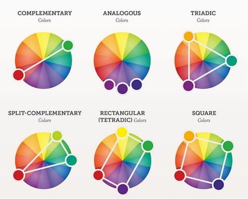
- Don’t try to reinvent the wheel – literally (reference a color wheel)! If you have a color you love or know you want to use, rely on a color wheel to let you know what other colors will go nicely with the one you’ve selected. Countless studies have been conducted over the years and we know that certain combinations just work. Color schemes with numerous colors are bolder and more dramatic than those with just one or two colors. If you know you want to use blue, look at the color schemes to see what other colors play nicely with blue. Explore the complimentary, analogous and triadic combinations.
- Bold colors work well on accent walls, especially ones with indirect light.
- Bold colors can get old and overwhelming, fast. A deep red may make for a beautiful accent wall, but an entire room can be overwhelming. Remember, it’s easy to change the color of an accent wall. It becomes more cumbersome to paint an entire room, let alone an entire house.
- Bold colors can work in a space, though, if all the other elements of the space (furniture, artwork, fabrics) are softer or more muted (think neutrals or whites).
- Balance is key. Too much of one color can be exhausting for someone who has to spend a large amount of time in that space.
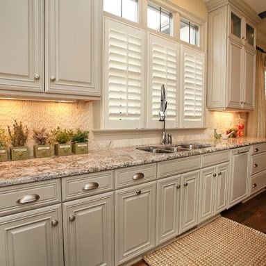
Sherwin Williams, Amazing Grey featured on the Kitchen Cabinets
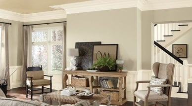
Sherwin Williams, Wool Skein featured on Living Room Walls
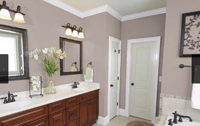
Sherwin Williams, Truly Taupe featured on Bathroom Walls
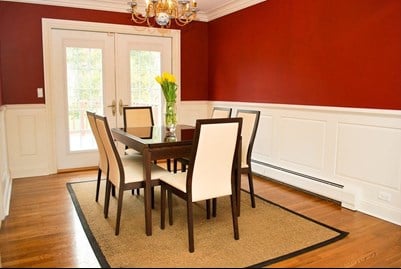
Sherwin Williams, Hearthrob featured on Dining Room Walls
Want some fool-proof colors for your home?
- Living Room: SW 6148 Wool Skein or SW 7018 Dovetail
- Kitchen: SW 7044 Amazing Gray or SW 6211 Rainwashed
- Dining Room: SW 6866 Heartthrob (as a single accent wall or incorporated into a wainscoting application – as pictured above)
- Bathroom: SW 6038 Truly Taupe
Lastly, We put together a Quick Reference Color Guide to help determine the good and bad associated with various colors you may be leaning towards when deciding on paint for your home. Also, unbeknownst to many people, colors can also have an impact on your health and well-being.
Red
- Positive associations: Bold, confidence, courage, excitement, love, passion, festiveness (holiday color)
- Negative associations: Anger, hatred, rage, debt (when an account is “in the red”), embarrassment (when someone is “red in the face”)
- Health effects: when exposed to red lighting, our bodies secrete more adrenalin, increase blood pressure and appetite, can raise breathing rate and body temperature slightly, increases impulse-buying tendencies (used in fast-food restaurants to indicate quick and fast service)
Blue
- Positive associations: Cool and calming (associated with water), cleanliness, royalty, success/achievement (think blue ribbon), strength and authority (blue uniforms in military and civil service)
- Negative associations: Introversion, sadness and depression (avoid this by using multiple shades of blue), can give the implication of coldness
- Health effects: known to reduce appetite (ever see a predominately BLUE fast-food restaurant? Nope.), blue light will slow heart rates, decrease body temperatures and relax muscles, aids balance and equilibrium
Green
- Positive associations: Growth, life, relaxation, healing, natural, freshness, youth, wealth (money!)
- Negative associations: Envy, certain shades can be associated with poison, inexperience or immaturity, sourness
- Health effects: Assists with balance and equilibrium, can help with twitching or muscle spasms, associated with health and well-being
Yellow
- Positive associations: Cheerful, sunny, gold, happiness, vitality, optimism, self-esteem, hope (Yellow Ribbons)
- Negative associations: Caution, sickness, nervousness, irritability
- Health effects: Speeds up metabolism, enhances concentration (legal pads and pencils!)
Purple
- Positive associations: Bravery, mystery, royalty, sacred, aristocratic, lighter shades are soft and atmospheric, darker shades imply elegance or indulgences
- Negative associations: Conceit, mourning, pompousness, ostentation
- Health effects: violet shades can calm anxiety
Orange
- Positive associations: Warm, fruitful, bright, happy and cheerful, strength and endurance, festivity
- Negative associations: Danger, brashness, can seem intrusive
- Health effects: Can increase pulse as well as the amount of oxygen supplied to the brain
White
- Positive associations: Purity, birth, cleanliness, innocence
- Negative associations: Surrender, emptiness, can make a space feel cold and clinical
Black
- Positive associations: Sophistication and power, safety and security
- Negative associations: Death, emptiness, bad luck
- Health effects: Can induce sadness and fear
Brown
- Positive associations: Warm, associated with home and the comforts therein, security
- Negative associations: Can be gloomy or imply boredom
- Health effects: Can cause depression if used too heavily, but adds stability if used correctly
Gray
- Positive associations: Technological, intelligence (think the gray matter of the brain), wealth (silver and platinum)
- Negative associations: Confusion, loss of distinction, depression, old-age
- Health effects: Has been shown to help with hormone imbalances
For more interior design tips and tricks, stay tuned to our blog! We will share great tips from our on-staff Interior Design Consultant, Heather, a few times each month.
< Back to Blog